
Choosing the right wall paint colors and trim combinations can transform the appearance of a Portland home. However, coordinating these surfaces requires more than selecting two attractive shades. Portland’s frequent cloudy weather, limited natural light during winter, and variety of traditional and contemporary home styles can influence how paint colors look indoors. A combination that appears balanced in a paint store may look completely different once applied to walls, baseboards, doors, and window frames.
Homeowners planning an interior update should consider how wall colors, trim shades, lighting, furniture, and architectural details work together. Whether you prefer a modern neutral palette or a more traditional interior, professional color selection and application can help create a cohesive appearance. MBK Painting provides professional interior painting services in Portland, helping homeowners choose suitable colors and achieve attractive, durable finishes.
1. Consider Your Home’s Natural Lighting
Natural lighting plays an important role in how wall paint colors appear throughout the day. Portland’s cloudy conditions can make some rooms feel darker, especially during fall and winter. As a result, colors that look warm and inviting in bright sunlight may appear cooler or more muted indoors.
For rooms with limited natural light, consider warm whites, soft beige, light greige, and other balanced neutral shades. These colors can help create a brighter atmosphere without making the interior feel overly stark.
Trim color should complement the selected wall shade. For example, warm white trim can work beautifully with beige or greige walls, while a cleaner white may provide an attractive contrast against cooler gray tones.
Professional color consultation helps homeowners understand how different shades interact with their home’s lighting before committing to an entire interior painting project.
2. Choose Between Matching and Contrasting Trim Colors
One important decision is whether to match the trim to the walls or create contrast.
Matching colors: Using similar shades for walls and trim creates a seamless, contemporary appearance. This approach works particularly well in minimalist interiors, smaller rooms, and spaces where homeowners want architectural details to blend into the overall design.
Contrasting colors: A lighter trim against darker walls creates definition and highlights architectural features. White trim paired with navy, charcoal, or deep green walls can produce a classic and sophisticated appearance.
Coordinated neutral shades: Another option is choosing two related neutral colors. For instance, warm gray walls with creamy white trim provide subtle contrast without making the room feel visually busy.
The right approach depends on the home’s architecture, room dimensions, flooring, and existing décor.
3. Coordinate Paint Colors With Portland Home Styles
Portland features a mixture of older craftsman houses, traditional residences, renovated properties, and modern homes. Each architectural style presents different opportunities for coordinating wall and trim colors.
Craftsman homes often feature detailed woodwork, built-in shelving, window casings, and decorative baseboards. Contrasting trim can emphasize these architectural elements while maintaining a traditional appearance.
Modern homes may benefit from simpler combinations, such as soft white walls with slightly darker neutral trim or matching wall and trim colors for a streamlined finish.
Older Portland properties may also contain original woodwork that homeowners want to preserve visually. In these situations, selecting complementary wall colors can help highlight existing architectural character without overwhelming the room.
A professional painting team can evaluate these details and recommend color combinations that support the home’s original design.
4. Pay Attention to Undertones
Two paint colors may appear similar at first but have different undertones. Understanding these differences is essential when coordinating walls and trim.
Common undertones include:
- Warm undertones: Beige, cream, and yellow-based whites create a welcoming atmosphere.
- Cool undertones: Blue-gray and cooler whites can produce a clean, contemporary appearance.
- Neutral undertones: Balanced shades of gray, greige, and off-white offer flexibility across different interior styles.
For example, pairing a cool gray wall with a strongly yellow-toned cream trim may create an unintended visual clash. Similarly, warm beige walls can look disconnected when paired with an overly cool white.
Homeowners should evaluate paint samples together rather than selecting wall and trim shades independently. Lighting, flooring, countertops, and furniture should also influence the final decision.
5. Select the Right Paint Finish for Walls and Trim
Color is only one part of a successful interior painting project. Paint sheen also affects how walls and trim look and perform.
Walls commonly use flat, matte, eggshell, or satin finishes, depending on the room and desired appearance. Trim often benefits from a more durable satin or semi-gloss finish because baseboards, doors, and window frames experience frequent contact.
A slight difference in sheen can help distinguish trim from walls even when the colors are similar.
For Portland households with children, pets, or frequently used living areas, choosing appropriate finishes can also make routine cleaning easier. Professional painters understand how to match the coating to the surface and its intended use.
6. Test Wall Paint Colors and Trim Combinations Before Painting
One common mistake is choosing colors based only on small paint chips or digital images. Screens and store lighting cannot accurately reproduce how a shade will appear throughout an entire room.
Instead, homeowners should evaluate larger samples in the actual space. Observe them in morning, afternoon, and evening lighting. Compare the proposed wall and trim colors alongside flooring, furniture, cabinetry, and other permanent features.
This step is particularly valuable in Portland homes, where natural lighting can change significantly between seasons.
Professional color consultation can simplify this process. MBK Painting works closely with homeowners to understand their preferences and recommend colors and finishes that complement their décor.
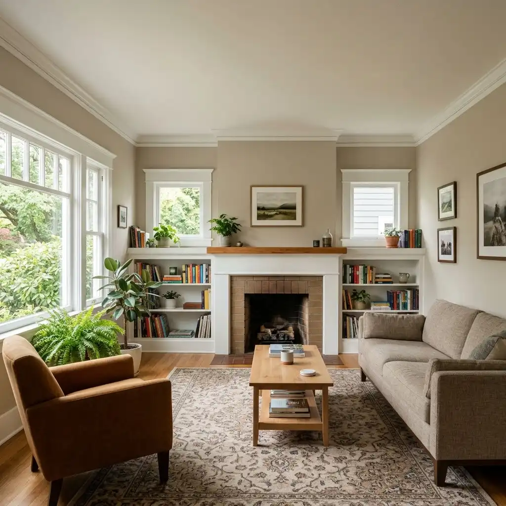
7. A Portland Home Color Transformation: A Practical Example
Consider a homeowner in Cedar Mill who wants to update a traditional living room. The existing walls are painted a cool gray, while the trim has an aging yellowish-white appearance. Although both colors are individually attractive, they create an inconsistent look throughout the space.
The homeowner wants a warmer, more inviting interior without losing the room’s traditional character.
After evaluating the room’s natural lighting, flooring, and furniture, a professional painting team recommends warm greige walls paired with soft white trim. The combination introduces warmth while maintaining enough contrast to highlight the baseboards, door frames, and window casings.
Before painting, the team assesses the existing surfaces, addresses imperfections, and prepares the walls and trim for the selected coatings. Appropriate finishes are then applied to create a consistent appearance across both surfaces.
The updated room feels more coordinated, and its architectural details become an attractive part of the overall design.
This illustrative scenario demonstrates how thoughtful color coordination and professional application can improve an interior without requiring major renovations.
8. Why Professional Interior Painting Matters
Coordinating wall paint colors and trim requires careful planning, accurate color selection, and precise application. Even an excellent color combination can produce disappointing results if the surfaces are not prepared correctly.
MBK Painting brings more than 25 years of interior and exterior painting experience to residential projects. The company focuses on quality workmanship, premium paints, careful preparation, and attention to detail.
Its professional interior painting process includes several important considerations:
Surface preparation: Walls and trim are inspected for cracks, holes, peeling paint, and other imperfections. Necessary repairs and preparation help create smooth, consistent surfaces.
Color consultation: The team works with homeowners to understand their preferred style, existing décor, and desired appearance. Professional recommendations help narrow down suitable wall and trim combinations.
Precise application: Painting around baseboards, door frames, windows, ceilings, and corners requires controlled techniques. Experienced painters use appropriate brushes, rollers, and masking methods to produce clean lines and consistent coverage.
Furniture and floor protection: Interior painting requires careful protection of household belongings. MBK Painting prioritizes cleanliness and efficiency, taking precautions to protect furniture and floors while completing the project.
Premium materials: Selecting suitable paints and primers helps support attractive, durable results. MBK Painting emphasizes high-quality products and proper application techniques for interior surfaces.
These professional considerations are particularly important when updating multiple rooms or coordinating several colors throughout an entire home.

9. Maintain a Consistent Color Scheme Throughout Your Home
When painting several rooms, homeowners should consider how each space connects to the next. Dramatically different wall and trim combinations can make an open floor plan feel disconnected.
Using a consistent trim color throughout the home is one effective way to create visual continuity. Individual rooms can still feature different wall shades while maintaining a shared design element.
For example, a home might use warm white trim throughout, with light greige in the living room, muted sage in the bedroom, and soft beige in the dining area.
Hallways, doorways, and connecting spaces deserve particular attention because they bring different color combinations together.
A professional painting team can help establish a coordinated palette that creates a natural transition between rooms.
FAQs About Coordinating Wall Paint Colors and Trim
Should trim be lighter or darker than wall paint?
Trim is traditionally lighter than walls because it creates contrast and highlights architectural details. However, matching or darker trim can also work for modern and contemporary interiors.
What wall colors work best with white trim?
White trim pairs well with greige, beige, soft gray, sage green, navy, and many other shades. The best combination depends on the trim’s undertone and the room’s lighting.
Should all trim in a Portland home be the same color?
Using one consistent trim color throughout a home creates visual continuity. However, different combinations may be appropriate when rooms have distinct architectural features or design requirements.
What paint finish is best for interior trim?
Satin and semi-gloss finishes are popular choices because they offer durability and are easier to clean than many flat finishes. The appropriate option depends on the surface and desired appearance.
Transform Your Portland Home With Professional Interior Painting
Coordinating wall paint colors and trim is an effective way to refresh your home’s interior, highlight architectural details, and create a more inviting atmosphere. However, achieving a balanced result requires thoughtful color selection, suitable paint finishes, and precise preparation.
MBK Painting provides professional interior painting services throughout Portland and surrounding communities, including Cedar Mill, Cedar Hills, Bethany, Beaverton, Tigard, Lake Oswego, and the greater Portland Metro area.
Whether you are updating one room or planning a complete interior transformation, the team works closely with homeowners to understand their vision and deliver quality results.
Ready to refresh your home’s interior? Call MBK Painting at (503) 773-4957 or request a quote to discuss your interior painting project.